Analytics shouldn’t be a decoration; it should be your team’s truth serum. The XmartPro.ai Analytics page is a consolidated results dashboard that turns every click, ticket, sprint, and release into a clear story: what’s working, what’s drifting, and what to fix next. Instead of chasing reports across tools, you get one live cockpit that connects Overview, Discover, Plan, Build, DevOps, Sustain, and Evolve—so decisions stop being opinions and start being evidence. No drama—just data live. Today.
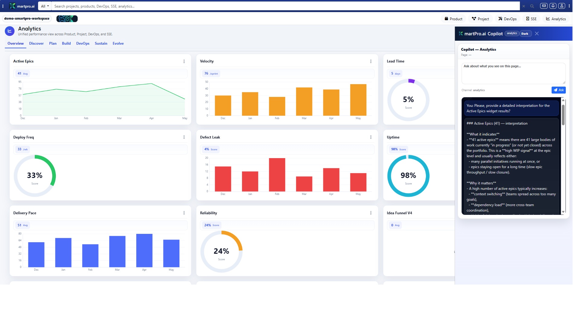
Start in Overview and you’ll see the numbers leaders actually ask for: portfolio health, delivery confidence, cycle time, throughput, SLA status, incident trend, and outcome progress—rolled up by workspace, team, product, and time window. One glance shows where momentum is real and where it’s performative. Drill down without losing context, because every KPI links to the work items, releases, or tickets that created it. It’s a dashboard that tells the truth, fast. No filters gymnastics, ever. Go
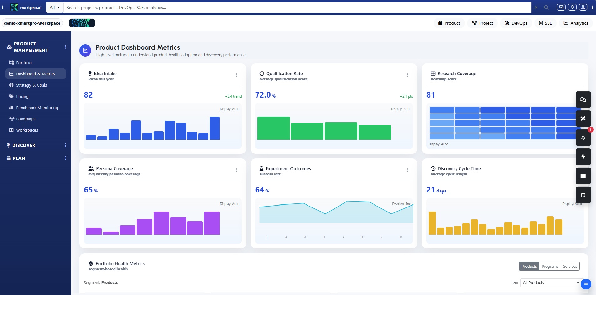
In Discover, Analytics answers the spicy questions: Are we listening to the right customers, or just the loudest? Track idea volume, duplicate rate, theme concentration, and time-to-triage. See which personas and journey steps generate the most friction, and which experiments actually increased confidence. You can measure how many insights become validated opportunities, and how many die on the vine—then fix the intake, not the people. Evidence wins. You can tag sources: Sales, Support, Usage!!!
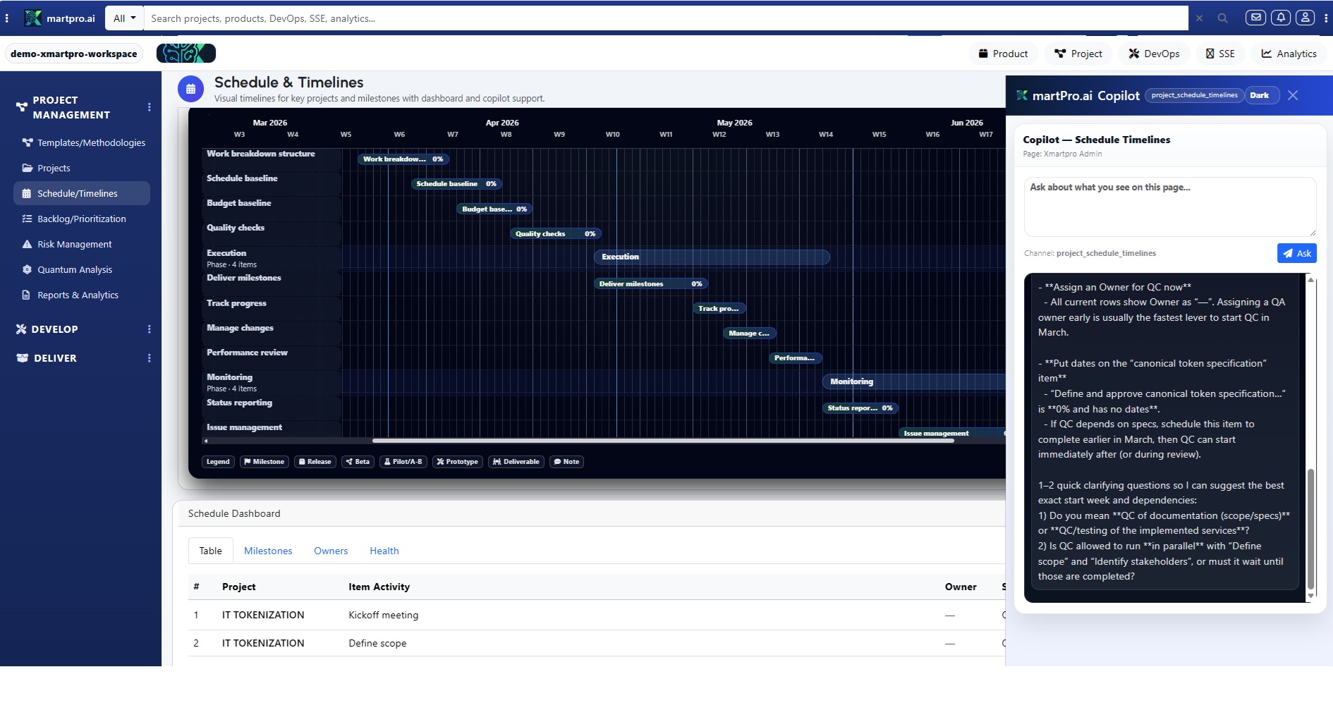
In Plan, the dashboard exposes whether your roadmap is smart—or just pretty. Compare initiative scores (RICE, WSJF, cost/benefit, risk, confidence) against actual delivery and outcome movement. Watch scope creep in real time as changes hit epics and milestones. See dependency heatmaps, budget burn, and OKR coverage, so you can defend tradeoffs with receipts. When priorities shift, you’ll know who changed what, why, and what it broke—before the quarter breaks you. This is planning with teeth—yep.
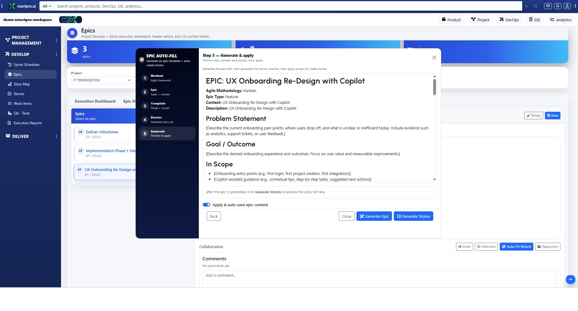
In Build, Analytics is your delivery mirror: sprint burndown, flow efficiency, WIP, blockers, cycle time, lead time, and throughput—by team and by work type. You’ll spot bottlenecks like “too many in review” or “QA is drowning” before morale tanks. Quality isn’t a rumor either: track defect injection, reopen rates, and acceptance pass rates tied to stories. Less status theater, more momentum you can prove with numbers. And because items link back to goals, you know if speed is creating value. ;)
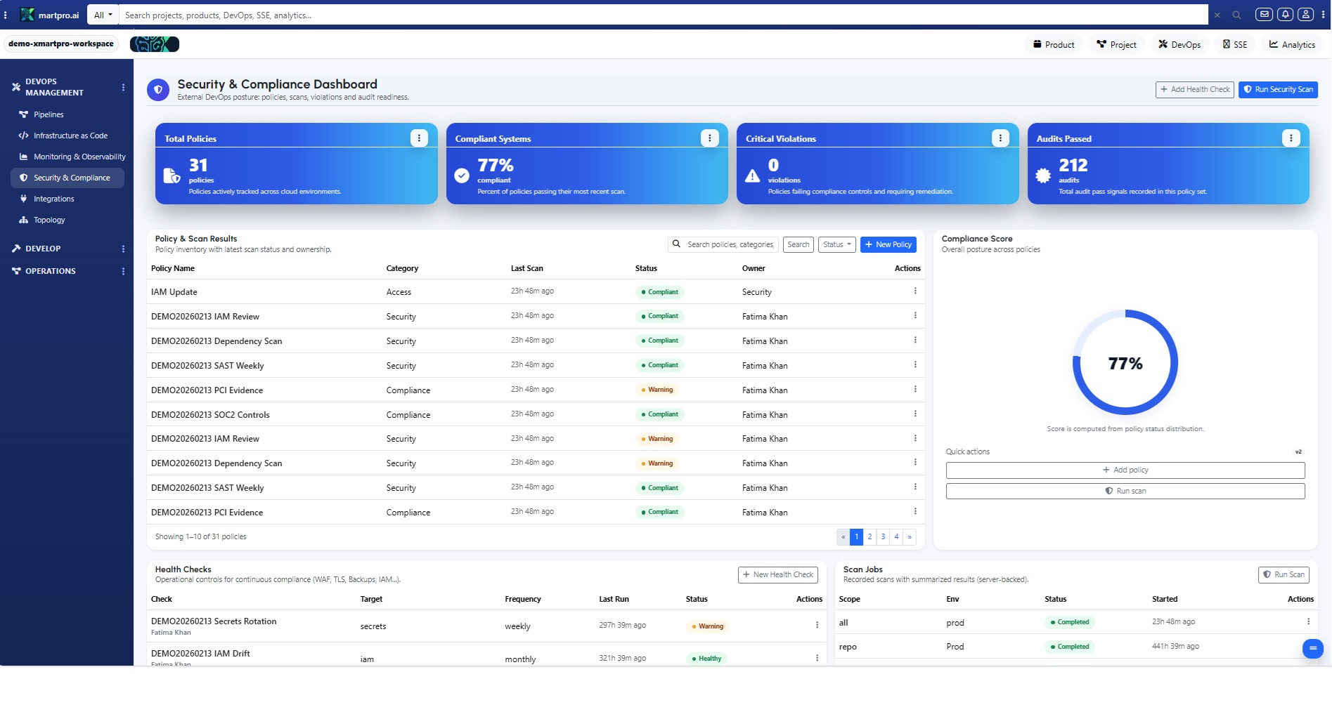
DevOps Analytics is where confidence gets real. Track DORA-style signals—deployment frequency, lead time for changes, change failure rate, and MTTR—alongside release readiness and environment stability. See which services are fragile, which pipelines are slow, and which teams are shipping safely. When an incident hits, the dashboard links it to the release and work items that triggered it, so you fix causes, not symptoms. Fast is great; fast-and-stable is the flex. With receipts not screenshots.
In Sustain, the dashboard shows whether you’re paying down debt—or letting it collect interest. Track recurring issue clusters, root-cause categories, aging technical tasks, and the cost of “we’ll do it later.” Measure stability improvements after sustain epics ship: fewer repeats, lower incident volume, shorter MTTR. Because Sustain is linked to releases and knowledge, you can prove reliability gains and protect time for preventative work without begging. Calm becomes measurable, not mythical!!
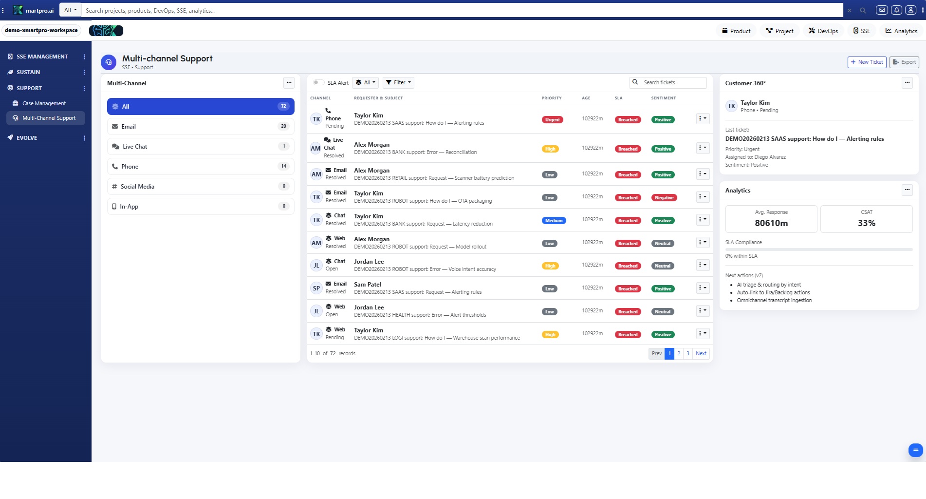
Support Analytics keeps you honest about customer experience. Track ticket volume by severity, first response, time to resolution, reopen rate, SLA breaches, and escalation hotspots—by tenant and product area. See which articles deflect cases, which issues repeat, and where training or UX fixes will cut load fast. Because tickets link to roadmap items, you can prove a fix reduced noise, then notify customers when it ships. Support stops being chaos; it becomes a growth lever. Loudly and proudly.
Evolve Analytics answers the big one: did we actually make the product better? Track adoption, usage lift, drop-off reduction, NPS or sentiment notes, and outcome progress after launches. Compare cohorts before/after a feature and see whether improvements reduced support load or boosted conversion. Tie every learning to the original hypothesis, so your team gets smarter each iteration instead of repeating “what we think.” This is continuous improvement with receipts—and it’s addictive. For real.
What makes XmartPro.ai Analytics different from competitor dashboards is that it isn’t stitched together. Because Product, Project, DevOps, and SSE share one system of work, the metrics agree. Roll up for execs, drill down for teams, and slice by tenant, workspace, sprint, release, or time—without spreadsheet detours. Want faster decisions and fewer surprises? Start here: pick one goal, watch signals move, and let data pull the org forward. Your story stays connected: insight → ship → learn. OK.

Share This News